Package: gtk
Class gtk:dialog
Superclassesgtk:window, gtk:widget, gobject:initially-unowned, gtk:accessible, gtk:buildable, gtk:constraint-target, gtk:native, gtk:root, gtk:shortcut-manager, gobject:object, common-lisp:standard-object, common-lisp:t Documented Subclassesgtk:app-chooser-dialog, gtk:color-chooser-dialog, gtk:file-chooser-dialog, gtk:font-chooser-dialog, gtk:message-dialog, gtk:page-setup-unix-dialog, gtk:print-unix-dialog Direct SlotsDetails
Dialogs are a convenient way to prompt the user for a small amount of input.
Typicall uses are to display a message, ask a question, or anything else that
does not require extensive effort on the part of the user. 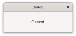 Figure: GtkDialog The main area of a gtk:dialog widget is called the "content area", and is yours to populate with widgets such a gtk:label or a gtk:entry widget, to present your information, questions, or tasks to the user. In addition, dialogs allow you to add "action widgets". Most commonly, action widgets are buttons. Depending on the platform, action widgets may be presented in the header bar at the top of the window, or at the bottom of the window. To add action widgets, create your gtk:dialog widget using the gtk:dialog-new-with-buttons function, or use the gtk:dialog-add-button, gtk:dialog-add-buttons, or gtk:dialog-add-action-widget functions. The gtk:dialog widgets uses some heuristics to decide whether to add a Close button to the window decorations. If any of the action buttons use the :close or :cancel response ID, the Close button is omitted. Clicking a button that was added as an action widget will emit the "response" signal with a response ID that you specified. GTK will never assign a meaning to positive response IDs. These are entirely user-defined. But for convenience, you can use the response IDs in the gtk:response-type enumeration, these all have values less than zero. If a dialog receives a delete event, the "response" signal will be emitted with the :delete-event response ID. Dialogs are created with a call to the gtk:dialog-new function or the gtk:dialog-new-with-buttons function. The latter is recommended. It allows you to set the dialog title, some convenient flags, and add buttons. A "modal" dialog, that is, one which freezes the rest of the application from user input, can be created by calling the gtk:window-modal function on the dialog. When using the gtk:dialog-new-with-buttons function, you can also pass the :modal flag to make a dialog modal. Examples
;; Function to open a dialog to display the message provided.
(defun create-quick-message (parent msg)
  (let ((dialog (gtk:dialog-new-with-buttons "Message"
                                             parent
                                             '(:destroy-with-parent :modal)
                                             "OK"
                                             :ok)))
    (g:signal-connect dialog "response"
                      (lambda (widget response)
                        (declare (ignore response))
                        (gtk:window-destroy widget)))
    (gtk:box-append (gtk:dialog-content-area dialog)
                    (make-instance 'gtk:label
                                   :label msg
                                   :margin-top 12
                                   :margin-bottom 12
                                   :margin-start 12
                                   :margin-end 12))
    (gtk:window-present dialog)))
GtkDialog as GtkBuildableThe gtk:dialog implementation supports a custom <action-widgets> element, which can contain multiple <action-widget> elements. The "response" attribute specifies a numeric response, and the content of the element is the ID of the widget, which should be a child of the action area of the dialog. To mark a response as default, set the "default" attribute of the <action-widget> element to true. The gtk:dialog implementation supports adding action widgets by specifying "action" as the "type" attribute of a <child> element. The widget will be added either to the action area or the headerbar of the dialog, depending on the use-header-bar property. The response ID has to be associated with the action widget using the <action-widgets> element. Example: A gtk:dialog UI definition fragment.
<object class="GtkDialog" id="dialog1">
  <child type="action">
    <object class="GtkButton" id="button_cancel"/>
  </child>
  <child type="action">
    <object class="GtkButton" id="button_ok">
      <property name="can-default">True</property>
    </object>
  </child>
  <action-widgets>
    <action-widget response="cancel">button_cancel</action-widget>
    <action-widget response="ok" default="true">button_ok</action-widget>
  </action-widgets>
</object> AccessibilityWarningSignal DetailsThe "close" signallambda (dialog) :action
The "response" signallambda (dialog response) :run-last
| Returned bySlot Access FunctionsInherited Slot Access FunctionsSee also |
2025-07-22