Package: gtk
Class gtk:switch
Superclassesgtk:widget, gobject:initially-unowned, gtk:accessible, gtk:buildable, gtk:constraint-target, gtk:actionable, gobject:object, common-lisp:standard-object, common-lisp:t Documented Subclasses
None
Direct SlotsDetails The gtk:switch widget is a widget that has two states: on or off. 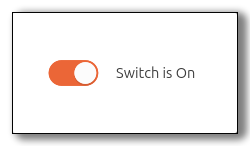 Figure: GtkSwitch The user can control which state should be active by clicking the switch, or by dragging the handle. The gtk:switch widget can also handle situations where the underlying state changes with a delay. See the "state-set" signal for details. CSS nodesswitch ├── label ├── label ╰── sliderThe gtk:switch implementation has four CSS nodes, the main node with the name switch and subnodes for the slider and the on and off labels. Neither of them is using any style classes. AccessibilitySignal DetailsThe "activate" signallambda (switch) :action
The "state-set" signallambda (switch state) :run-last
To implement delayed state change, applications can connect to this signal, initiate the change of the underlying state, and call the gtk:switch-state function when the underlying state change is complete. The signal handler should return true to prevent the default handler from running. Visually, the underlying state is represented by the trough color of the switch, while the active property is represented by the position of the switch. | Returned bySlot Access FunctionsInherited Slot Access FunctionsSee also |
2025-07-01