Package: gtk
Class gtk:toggle-button
Superclassesgtk:button, gtk:widget, gobject:initially-unowned, gtk:accessible, gtk:buildable, gtk:constraint-target, gtk:actionable, gobject:object, common-lisp:standard-object, common-lisp:t Documented Subclasses
None
Direct SlotsDetails The gtk:toggle-button widget is a gtk:button widget that
will remain "pressed-in" when clicked.
Clicking again will cause the toggle button to return to its normal state. 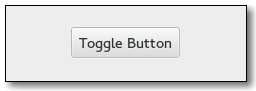 Figure: GtkToggleButton A toggle button is created by calling either the gtk:toggle-button-new or gtk:toggle-button-new-with-label functions. If using the former, it is advisable to pack a widget, such as a gtk:label or a gtk:image widget, into the container of the toggle button. See the gtk:button documentation for more information. The state of a gtk:toggle-button widget can be set and retrieved using the gtk:toggle-button-active function. GroupingToggle buttons can be grouped together, to form mutually exclusive groups. Only one of the buttons can be toggled at a time, and toggling another one will switch the currently toggled one off. To add a toggle button to a group, use the gtk:toggle-button-group function.Examples
(defun do-toggle-button-action (&optional application)
  (let* ((vbox (make-instance 'gtk:box
                              :orientation :vertical
                              :spacing 12
                              :margin-top 12
                              :margin-bottom 12
                              :margin-start 48
                              :margin-end 48))
         (window (make-instance 'gtk:window
                                :title "Toggle Buttons with Action"
                                :child vbox
                                :application application
                                :resizable nil))
         (label (make-instance 'gtk:label
                               :margin-top 9
                               :margin-bottom 6
                               :label "<b>Button ? is active</b>"
                               :use-markup t
                               :use-underline t))
         (action (g:simple-action-new-stateful "toggled"
                                               (g:variant-type-new "s")
                                               (g:variant-new-string "top")))
         (button nil))
    ;; Configure the "toggled" action
    (g:action-map-add-action application action)
    (g:signal-connect action "activate"
            (lambda (action parameter)
              (g:action-change-state action parameter)))
    (g:signal-connect action "change-state"
            (lambda (action parameter)
              (let ((str (g:variant-string parameter)))
                (cond ((string= str "top")
                       (setf (gtk:label-label label)
                             "<b>Button Top is active</b>"))
                      ((string= str "center")
                       (setf (gtk:label-label label)
                             "<b>Button Center is active</b>"))
                      (t
                       (setf (gtk:label-label label)
                             "<b>Button Bottom is active</b>")))
                (setf (g:action-state action) parameter))))
    ;; Create three grouped toggle buttons
    (setf button (gtk:toggle-button-new-with-mnemonic "Button _Top"))
    (gtk:actionable-set-detailed-action-name button "app.toggled::top")
    (gtk:box-append vbox button)
    ;; Create and add the second radio button to the group
    (setf button (gtk:toggle-button-new-with-mnemonic "Button _Center"))
    (gtk:actionable-set-detailed-action-name button "app.toggled::center")
    (gtk:box-append vbox button)
    ;; Create and add the third toggle button to the group
    (setf button (gtk:toggle-button-new-with-mnemonic "Button _Bottom"))
    (gtk:actionable-set-detailed-action-name button "app.toggled::bottom")
    (gtk:box-append vbox button)
    ;; Add a label which shows the status of the toggle buttons
    (gtk:box-append vbox label)
    ;; Make the "app.toggled::center" action active
    (g:action-activate (g:action-map-lookup-action application "toggled")
                       (g:variant-new-string "center"))
    ;; Present window
    (gtk:window-present window)))
CSS nodesSignal Details | Returned bySlot Access FunctionsInherited Slot Access FunctionsSee also |
2025-07-31