Package: gtk
Class gtk:check-button
Superclassesgtk:widget, gobject:initially-unowned, gtk:accessible, gtk:actionable, gtk:buildable, gtk:constraint-target, gobject:object, common-lisp:standard-object, common-lisp:t Documented Subclasses
None
Direct SlotsDetails The gtk:check-button widget places a label next to an indicator. 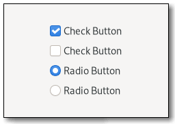 Figure: GtkCheckButton The gtk:check-button widget is created by calling either the gtk:check-button-new or gtk:check-button-new-with-label functions. The state of a check button can be set specifically using the gtk:check-button-active function. Inconsistent stateIn addition to "on" and "off", check buttons can be an "in between" state that is neither on nor off. This can be used, for example, when the user has selected a range of items, such as some text or spreadsheet cells, that are affected by a check button, and the current values in that range are inconsistent. To set a check button to inconsistent state, use the gtk:check-button-inconsistent function.GroupingCheck buttons can be grouped together, to form mutually exclusive groups. Only one of the buttons can be toggled at a time, and toggling another one will switch the currently toggled one off. Grouped check buttons use a different indicator, and are commonly referred to as radio buttons. To add a gtk:check-button widget to a group, use the gtk:check-button-group function.Examples
(defun do-check-button (&optional application)
  (let* ((grid (make-instance 'gtk:grid
                              :column-spacing 24
                              :row-spacing 12
                              :halign :center
                              :margin-top 12
                              :margin-bottom 12
                              :margin-start 12
                              :margin-end 12))
         (window (make-instance 'gtk:window
                                :title "Check Buttons"
                                :child grid
                                :application application
                                :resizable nil))
         (group nil) (button nil))
    ;; Create three radio buttons and put the buttons into the grid
    (setf button (gtk:check-button-new-with-label "Radio 1"))
    (setf group button)
    (gtk:grid-attach grid button 0 0 1 1)
    ;; Create and add the second radio button to the group
    (setf button (gtk:check-button-new-with-label "Radio 2"))
    (setf (gtk:check-button-group button) group)
    (gtk:grid-attach grid button 0 1 1 1)
    ;; Make second radio button active
    (setf (gtk:check-button-active button) t)
    ;; Create and add the third radio button to the group
    (setf button (gtk:check-button-new-with-label "Radio 3"))
    (setf (gtk:check-button-group button) group)
    (gtk:grid-attach grid button 0 2 1 1)
    ;; Create three check buttons and put the buttons into the grid
    (gtk:grid-attach grid
                     (gtk:check-button-new-with-mnemonic "Check _1")
                     1 0 1 1)
    (gtk:grid-attach grid
                     (gtk:check-button-new-with-mnemonic "Check _2")
                       1 1 1 1)
    (gtk:grid-attach grid
                     (gtk:check-button-new-with-mnemonic "Check _3")
                     1 2 1 1)
    ;; Make first check button active
    (setf (gtk:check-button-active (gtk:grid-child-at grid 1 0)) t)
    ;; Present window
    (gtk:window-present window)))
CSS nodescheckbutton[.text-button] ├── check ╰── [label]The gtk:check-button implementation has a main node with name checkbutton. If the label property is set, it contains a label child. The indicator node is named check when no group is set, and radio if the check button is grouped together with other check buttons. AccessibilitySignal Details | Returned bySlot Access Functions
Inherited Slot Access FunctionsSee also |
2025-07-12