Package: gtk
Class gtk:spin-button
Superclassesgtk:widget, gobject:initially-unowned, gtk:accessible, gtk:buildable, gtk:constraint-target, gtk:orientable, gtk:editable, gtk:cell-editable, gobject:object, common-lisp:standard-object, common-lisp:t Documented Subclasses
None
Direct SlotsDetails The gtk:spin-button widget is an ideal way to allow the user to set
the value of some attribute. Rather than having to directly type a number into a gtk:entry widget,
the spin button allows the user to click on one of two arrows to increment or
decrement the displayed value. A value can still be typed in, with the bonus
that it can be checked to ensure it is in a given range. 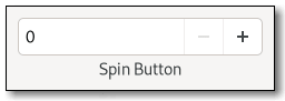 Figure: GtkSpinButton The main properties of a gtk:spin-button widget are through an adjustment. See the gtk:adjustment class for more details about the properties of an adjustment. Note that the gtk:spin-button widget will by default make its entry large enough to accommodate the lower and upper bounds of the adjustment. If this is not desired, the automatic sizing can be turned off by explicitly setting the width-chars property to a value not equal to -1. CSS nodesspinbutton.horizontal ├── undershoot.left ├── undershoot.right ├── entry │ ╰── ... ├── button.down ╰── button.upThe gtk:spin-button implementation main CSS node has the name spinbutton. It creates subnodes for the text entry and the two buttons, with these names. The button nodes have the .up and .down style classes. The gtk:entry subnodes, if present, are put below the text entry node. The orientation of the spin button is reflected in the .vertical or .horizontal style class on the main node. Examples
(let (...
(spinner (make-instance 'gtk:spin-button
:adjustment
(make-instance 'gtk:adjustment
:value 50.0
:lower 0.0
:upper 100.0
:step-increment 1.0
:page-increment 5.0
:page-size 0.0)
:climb-rate 0
:digits 0
:wrap t))) AccessibilitySignal Details | Returned bySlot Access FunctionsInherited Slot Access FunctionsSee also |
2025-07-17