Package: gtk
Class gtk:scale
Superclassesgtk:range, gtk:widget, gobject:initially-unowned, gtk:accessible-range, gtk:accessible, gtk:buildable, gtk:constraint-target, gtk:orientable, gobject:object, common-lisp:standard-object, common-lisp:t Documented Subclasses
None
Direct SlotsDetails The gtk:scale widget is a slider control used to select a numeric
value.
To use it, you will probably want to investigate the methods on its base gtk:range class, in addition to the methods for the gtk:scale
class itself. To set the value of a scale, you would normally use the gtk:range-value function. To detect changes to the value, you would normally use the "value-changed" signal. 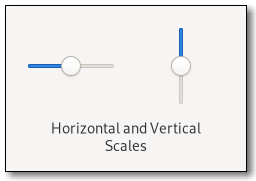 Figure: GtkScale Note that using the same upper and lower bounds for the gtk:scale widget, through the gtk:range methods, will hide the slider itself. This is useful for applications that want to show an undeterminate value on the scale, without changing the layout of the application, such as movie or music players. GtkScale as GtkBuildableCSS nodes
scale[.fine-tune][.marks-before][.marks-after]
├── [value][.top][.right][.bottom][.left]
├── marks.top
│   ├── mark
│   ┊    ├── [label]
│   ┊    ╰── indicator
┊   ┊
│   ╰── mark
├── marks.bottom
│   ├── mark
│   ┊    ├── indicator
│   ┊    ╰── [label]
┊   ┊
│   ╰── mark
╰── trough
    ├── [fill]
    ├── [highlight]
    ╰── slider
The gtk:scale implementation has a main CSS node with name scale and a subnode for its contents, with subnodes named trough and slider. The main node gets the .fine-tune
style class added when the scale is in 'fine-tuning' mode.If the scale has an origin, see the gtk:scale-has-origin function, there is a subnode with name highlight below the trough node that is used for rendering the highlighted part of the trough. If the scale is showing a fill level, see the gtk:range-show-fill-level function, there is a subnode with name fill below the trough node that is used for rendering the filled in part of the trough. If marks are present, there is a marks subnode before or after the contents node, below which each mark gets a node with name mark. The marks nodes get either the .top or .bottom style class. The mark node has a subnode named indicator. If the mark has text, it also has a subnode named label. When the mark is either above or left of the scale, the label subnode is the first when present. Otherwise, the indicator subnode is the first. The main CSS node gets the marks-before and/or marks-after style classes added depending on what marks are present. If the scale is displaying the value, see the draw-value property, there is subnode with name value. This node will get the .top or .bottom style classes similar to the marks node. Accessibility | Returned bySlot Access FunctionsInherited Slot Access FunctionsSee also |
2025-07-17