The uri property of type :string (Read / Write) The URI bound to this button. Default value: nil
visited
The visited property of type :boolean (Read / Write)
The visited state of this button. A visited link is drawn in a different color. Default value: false
Details
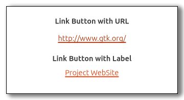
The gtk:link-button widget is a gtk:button widget with a
hyperlink, similar to the one used by web browsers, which triggers an
action when clicked. It is useful to show quick links to resources. A link button is created by calling either the gtk:link-button-new or gtk:link-button-new-with-label function. If using the former, the URI
you pass to the constructor is used as a label for the widget.
By default, the gtk:link-button widget calls the gtk:file-launcher-launch function when the button is clicked. This
behaviour can be overridden by connecting to the "activate-link" signal and returning true from the
signal handler.
CSS nodes
The gtk:link-button implementation has a single CSS node with name button. To differentiate it from a plain gtk:button widget, it gets the .link style class.
The signal is emitted each time the link button has been clicked. The default handler will call the gtk:file-launcher-launch function with the URI stored inside the uri property.
To override the default behavior, you can connect to the "activate-link" signal and stop the propagation of the signal by returning true from your handler.