Package: gtk
Class gtk:window-controls
Superclassesgtk:widget, gobject:initially-unowned, gtk:accessible, gtk:buildable, gtk:constraint-target, gobject:object, common-lisp:standard-object, common-lisp:t Documented Subclasses
None
Direct SlotsDetails The gtk:window-controls widget shows window frame controls, such as
Minimize, Maximize and Close buttons, and the window icon. 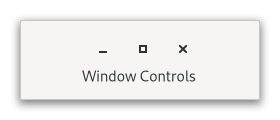 Figure: GtkWindowControls The gtk:window-controls widget only displays start or end side of the controls, see the side property, so it is intended to be always used in pair with another gtk:window-controls widget using the opposite side, for example:
<object class="GtkBox">
  <child>
    <object class="GtkWindowControls">
      <property name="side">start</property>
    </object>
  </child>
  ...
  <child>
    <object class="GtkWindowControls">
      <property name="side">end</property>
    </object>
  </child>
</object>
CSS nodeswindowcontrols ├── [image.icon] ├── [button.minimize] ├── [button.maximize] ╰── [button.close]The gtk:window-controls implementation has a CSS node called windowcontrols. It contains subnodes corresponding to each title button. Which of the title buttons exist and where they are placed exactly depends on the desktop environment and the decoration-layout property. When the empty property is true, it gets the .empty style class. Accessibility | Returned bySlot Access Functions
Inherited Slot Access FunctionsSee also |
2025-03-29