Package: gtk

Class gtk:list-box

Superclasses

Documented Subclasses

None

Direct Slots

accept-unpaired-release
The accept-unpaired-release property of type :boolean (Read / Write)
Whether to accept unpaired release events.
Default value: false
activate-on-single-click
The activate-on-single-click property of type :boolean (Read / Write)
Determines whether children can be activated with a single click, or require a double-click.
Default value: true
selection-mode
The selection-mode property of type gtk:selection-mode (Read / Write)
The selection mode used by the list box.
Default value: :single
show-separators
The show-separators property of type :boolean (Read / Write)
Whether to show separators between rows.
Default value: false
tab-behavior
The tab-behavior property of type gtk:list-tab-behavior (Read / Write)
The behavior of the Tab key. Since 4.18
Default value: :all

Details

The gtk:list-box widget is a vertical list box that contains gtk:list-box-row children. These rows can by dynamically sorted and filtered, and headers can be added dynamically depending on the row content. It also allows keyboard and mouse navigation and selection like a typical list.
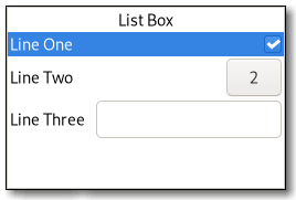

Figure: GtkListBox


Although a gtk:list-box widget must have only gtk:list-box-row children you can add any kind of widget to it via the gtk:list-box-prepend, gtk:list-box-append, and gtk:list-box-insert functions, and a gtk:list-box-row widget will automatically be inserted between the list and the widget.

The gtk:list-box-row widget can be marked as activatable or selectable. If a row is activatable, the "row-activated" signal will be emitted for it when the user tries to activate it. If it is selectable, the row will be marked as selected when the user tries to select it.

GtkListBox as GtkBuildable

The gtk:list-box implementation of the gtk:buildable interface supports setting a child as the placeholder by specifying "placeholder" as the "type" attribute of a <child> element. See also the gtk:list-box-set-placeholder function.

Shortcuts and Gestures

The following signals have default keybindings:

CSS Nodes

list[.separators][.rich-list][.navigation-sidebar][.boxed-list]
╰── row[.activatable]    
The gtk:list-box implementation uses a single CSS node named list. It may carry the .separators style class, when the show-separators property is set. Each gtk:list-box-row widget uses a single CSS node named row. The row nodes get the .activatable style class added when appropriate. It may also carry the .boxed-list style class. In this case, the list will be automatically surrounded by a frame and have separators. The main list node may also carry style classes to select the style of list presentation: .rich-list, .navigation-sidebar or .data-table.

Accessibility

The gtk:list-box implementation uses the :list role. The gtk:list-box-row implementation uses the :list-item role.

Signal Details

The "activate-cursor-row" signal
lambda (listbox)    :action :run-last      
listbox
The gtk:list-box widget on which the signal is emitted.
The signal is emitted when the cursor row is activated.
The "move-cursor" signal
lambda (listbox step count extend modify)    :action :run-last      
listbox
The gtk:list-box widget on which the signal is emitted.
step
The value of the gtk:movement-step enumeration.
count
The integer for the number of steps.
extend
The boolean whether to extend the selection.
modify
The boolean whether to modify the selection.
The signal is emitted when the user initiates a cursor movement. The default bindings for this signal come in two variants, the variant with the Shift modifier extends the selection, the variant without the Shift modifier does not. There are too many key combinations to list them all here.
  • , , , move by individual children,
  • Home, End move to the ends of the box,
  • PgUp, PgDn move vertically by pages.
The "row-activated" signal
lambda (listbox row)    :run-last      
listbox
The gtk:list-box widget on which the signal is emitted.
row
The activated gtk:list-box-row widget.
The signal is emitted when a row has been activated by the user.
The "row-selected" signal
lambda (listbox row)    :run-last      
listbox
The gtk:list-box widget on which the signal is emitted.
row
The selected gtk:list-box-row widget.
The signal is emitted when a new row is selected, or when the selection is cleared. When the list box is using the :multiple selection mode, this signal will not give you the full picture of selection changes, and you should use the "selected-rows-changed" signal instead.
The "select-all" signal
lambda (listbox)    :action :run-last      
listbox
The gtk:list-box widget on which the signal is emitted.
The signal is a keybinding signal which gets emitted to select all children of the list box, if the selection mode permits it. The default binding for this signal is the Ctrl-a key.
The "selected-rows-changed" signal
lambda (listbox)    :run-first      
listbox
The gtk:list-box widget on which the signal is emitted.
The signal is emitted when the set of selected rows changes.
The "toggle-cursor-row" signal
lambda (listbox)    :action :run-last      
listbox
The gtk:list-box widget on which the signal is emitted.
The signal is emitted when the cursor row is toggled. The default binding for this signal is Ctrl+␣.
The "unselect-all" signal
lambda (listbox)    :action :run-last      
listbox
The gtk:list-box widget on which the signal is emitted.
The signal is a keybinding signal which gets emitted to unselect all children of the list box, if the selection mode permits it. The default bindings for this signal is the Ctrl-Shift-a key.
 

Returned by

Slot Access Functions

Inherited Slot Access Functions

See also

2026-05-01