Package: gtk
Class gtk:expander
Superclassesgtk:widget, gobject:initially-unowned, gtk:accessible, gtk:buildable, gtk:constraint-target, gobject:object, common-lisp:standard-object, common-lisp:t Documented Subclasses
None
Direct SlotsDetails The gtk:expander widget allows the user to hide or show its child
by clicking on an expander triangle. 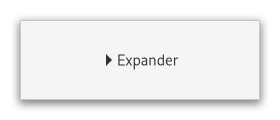 Figure: GtkExpander Normally you use an expander as you would use a frame. You create the child widget and use the gtk:expander-child function to add it to the expander. When the expander is toggled, it will take care of showing and hiding the child automatically. Special UsageThere are situations in which you may prefer to show and hide the expanded widget yourself, such as when you want to actually create the widget at expansion time. In this case, create a gtk:expander widget but do not add a child widget to it. The expander widget has an expanded property which can be used to monitor its expansion state. You should watch this property with a signal connection as follows:
(let ((expander (gtk:expander-new-with-mnemonic "_More Options")))
  (g:signal-connect expander "notify::expanded"
                    (lambda (object param)
                      (if (gtk:expander-expanded object)
                          ;; Show or create widgets
                          ...
                          ;; Hide or destroy widgets
                          ... )))
  ... )
GtkExpander as GtkBuildableExample: A UI definition fragment with a gtk:expander widget.
<object class="GtkExpander">
  <child type="label">
    <object class="GtkLabel" id="expander-label"/>
  </child>
  <child>
    <object class="GtkEntry" id="expander-content"/>
  </child>
</object>
CSS nodesexpander ├── title │ ├── arrow │ ╰── <label widget> ╰── <child>The gtk:expander implementation has three CSS nodes, the main node with the name expander, a subnode with name title and node below it with name arrow. The arrow of an expander that is showing its child gets the :checked pseudoclass added to it. AccessibilitySignal DetailsThe "activate" signallambda (expander) :action
| Returned bySlot Access Functions
Inherited Slot Access Functions |
2025-07-31