Package: gtk

Class gtk:drop-down

Superclasses

Documented Subclasses

None

Direct Slots

enable-search
The enable-search property of type :boolean (Read / Write)
Whether to show a search entry in the popup. Note that search requires the expression property to be set.
Default value: false
expression
The expression property of type gtk:expression (Read / Write)
An expression to evaluate to obtain strings to match against the search term See the enable-search property. If the factory property is not set, the expression is also used to bind strings to labels produced by a default factory.
factory
The factory property of type gtk:list-item-factory (Read / Write)
Factory for populating list items.
header-factory
The header-factory property of type gtk:list-item-factory (Read / Write)
The factory for creating header widgets for the popup. Since 4.12
list-factory
The list-factory property of type gtk:list-item-factory (Read / Write)
The factory for populating list items in the popup. If this is not set, the factory property is used.
model
The model property of type g:list-model (Read / Write)
Model for the displayed items.
search-match-mode
The search-match-mode property of type gtk:string-filter-match-mode (Read / Write)
The match mode for the search filter. Since 4.12
selected
The selected property of type :uint (Read / Write)
The position of the selected item in model, or gtk:+invalid-list-position+ if no item is selected.
Default value: gtk:+invalid-list-position+
selected-item
The selected-item property of type g:object (Read)
The selecte item.
show-arrow
The show-arrow property of type :boolean (Read / Write)
Whether to show an arrow within the GtkDropDown widget. Since 4.6
Default value: true

Details

The gtk:drop-down widget is a widget that allows the user to choose an item from a list of options. The gtk:drop-down widget displays the selected choice.
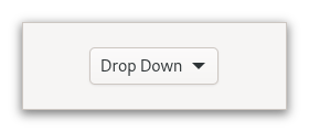
The options are given to the gtk:drop-down widget in the form of a g:list-model object, and how the individual options are represented is determined by a gtk:list-item-factory object. The default factory displays simple strings.

The gtk:drop-down widget knows how to obtain strings from the items in a gtk:string-list object. For other models, you have to provide an expression to find the strings via the gtk:drop-down-expression function.

The gtk:drop-down widget can optionally allow search in the popup, which is useful if the list of options is long. To enable the search entry, use the gtk:drop-down-enable-search function.

CSS nodes

The gtk:drop-down implementation has a single CSS node with name dropdown, with the button and popover nodes as children.

Accessibility

The gtk:drop-down implementation uses the :combo-box role of the gtk:accessible-role enumeration.

Signals

The "activate" signal
lambda (dropdown)    :action      
The signal is an action signal and emitting it causes the drop down to pop up its dropdown. The default handler is called before the handlers. Since 4.6
dropdown
The gtk:drop-down widget.
 

Returned by

Slot Access Functions

Inherited Slot Access Functions

See also

2024-1-10