Package: gtk
Class gtk:calendar
Superclassesgtk:widget, gobject:initially-unowned, gtk:accessible, gtk:buildable, gtk:constraint-target, gobject:object, common-lisp:standard-object, common-lisp:t Documented Subclasses
None
Direct SlotsDetails The gtk:calendar widget displays a Gregorian calendar, one month at
a time. It can be created with the gtk:calendar-new function. 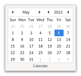 Figure: GtkCalendar The selected date can be retrieved and altered from a gtk:calendar widget using the gtk:calendar-date accessor function. To place a visual marker on a particular day, use the gtk:calendar-mark-day function and to remove the marker, the gtk:calendar-unmark-day function. Alternative, all marks can be cleared with the gtk:calendar-clear-marks function. Users should be aware that, although the Gregorian calendar is the legal calendar in most countries, it was adopted progressively between 1582 and 1929. Display before these dates is likely to be historically incorrect. Shortcuts and Gestures
CSS nodes
calendar.view
├── header
│   ├── button
│   ├── stack.month
│   ├── button
│   ├── button
│   ├── label.year
│   ╰── button
╰── grid
    ╰── label[.day-name][.week-number][.day-number][.other-month][.today]
The gtk:calendar implementation has a main node with name calendar. It contains a subnode called header containing the widgets for switching between years and months. The grid subnode
contains all day labels, including week numbers on the left. marked with the .week-number style class, and day names on top, marked with the .day-name style class. Day labels that belong to the previous or next month get the .other-month style class. The label of the current day get the .today style class. Marked day labels get the :selected state assigned. Signal DetailsThe "day-selection" signallambda (calendar) :run-first
The "next-month" signallambda (calendar) :run-first
The "next-year" signallambda (calendar) :run-first
The "prev-month" signallambda (calendar) :run-first
The "prev-year" signallambda (calendar) :run-first
| Returned bySlot Access Functions
Inherited Slot Access Functions |
2025-12-05