Package: gtk
Class gtk:menu
Superclassesgtk:menu-shell, gtk:container, gtk:widget, gtk:buildable, gobject:object, common-lisp:standard-object, common-lisp:t Documented SubclassesDirect SlotsDetails The gtk:menu widget is a gtk:menu-shell widget that implements a drop down menu consisting of a list of gtk:menu-item
widgets which can be navigated and activated by the user to perform
application functions. The gtk:menu widget is most commonly dropped down by activating a gtk:menu-item widget in a gtk:menu-bar widget or popped up by activating a gtk:menu-item widget in another gtk:menu widget. The gtk:menu widget can also be popped up by activating a gtk:combo-box widget. Other composite widgets such as the gtk:notebook widget can pop up a gtk:menu widget as well. Applications can display a gtk:menu widget as a popup menu by calling the gtk:menu-popup-at-pointer function. The example below shows how an application can pop up a menu when a mouse button is pressed. Examples
(defun example-menu-popup (&optional application)
  (gtk:within-main-loop
    (let ((window (make-instance 'gtk:window
                                 :type :toplevel
                                 :application application
                                 :default-width 300
                                 :default-height 180
                                 :title "Example Popup Menu"))
          (button (gtk:button-new-with-label "Click me")))
      ;; Create pop-up menu for button
      (let ((popup (make-instance 'gtk:menu))
            (bigitem (gtk:menu-item-new-with-label "Larger"))
            (smallitem (gtk:menu-item-new-with-label "Smaller")))
        (gtk:menu-shell-append popup bigitem)
        (gtk:menu-shell-append popup smallitem)
        (gtk:widget-show-all popup)
        ;; Signal handler to pop up the menu
        (g:signal-connect button "button-press-event"
           (lambda (widget event)
             (declare (ignore widget))
             (gtk:menu-popup-at-pointer popup event)
             t)))
      (g:signal-connect window "destroy"
                        (lambda (widget)
                          (declare (ignore widget))
                          (gtk:leave-gtk-main)))
      (gtk:container-add window button)
      (gtk:widget-show-all window))))
CSS nodesmenu ├── arrow.top ├── <child> ┊ ├── <child> ╰── arrow.bottomThe main CSS node of the gtk:menu implementation has name menu, and there are two subnodes with name arrow, for scrolling menu arrows. These subnodes get the .top and .bottom style classes. Child Property Detailsbottom-attach The bottom-attach child property of type :int (Read / Write) The row number to attach the bottom of the child to. Allowed values: >= -1 Default value: -1 left-attach The left-attach child property of type :int (Read / Write) The column number to attach the left side of the child to. Allowed values: >= -1 Default value: -1 right-attach The right-attach child property of type :int (Read / Write) The column number to attach the right side of the child to. Allowed values: >= -1 Default value: -1 top-attach The top-attach child property of type :int (Read / Write) The row number to attach the top of the child to. Allowed values: >= -1 Default value: -1 Style Property DetailsSignal DetailsThe "popped-up" signallambda (menu flipped final xflipped yflipped) :run-first
The flipped argument is the ideal position of the menu after any possible flipping, but before any possible sliding. The final argument is flipped, but possibly translated in the case that flipping is still ineffective in keeping menu on-screen. 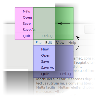 Figure: Popup slide The blue menu is the ideal position of the menu, the green menu is flipped, and the red menu is final. See the gtk:menu-popup-at-rect, gtk:menu-popup-at-widget, gtk:menu-popup-at-pointer functions, and the anchor-hints, rect-anchor-dx, rect-anchor-dy, and menu-type-hint properties. | Returned bySlot Access FunctionsInherited Slot Access FunctionsSee also |
#2025-06-27