Package: gtk
Class gtk:notebook
Superclassesgtk:container, gtk:widget, gtk:buildable, gobject:object, common-lisp:standard-object, common-lisp:t Documented Subclasses
None
Direct SlotsDetails The gtk:notebook widget is a gtk:container widget whose
children are pages that can be switched between using tab labels along one
edge. 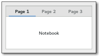 Figure: GtkNotebook There are many configuration options for gtk:notebook widgets. Among other things, you can choose on which edge the tabs appear, see the gtk:notebook-tab-pos function, whether, if there are too many tabs to fit the notebook should be made bigger or scrolling arrows added, see the gtk:notebook-scrollable function, and whether there will be a popup menu allowing the users to switch pages, see the gtk:notebook-popup-enable and gtk:notebook-popup-disable functions. GtkNotebook as GtkBuildableExample: A UI definition fragment with the gtk:notebook widget
<object class="GtkNotebook">
  <child>
    <object class="GtkLabel" id="notebook-content">
      <property name="label">Content</property>
    </object>
  </child>
  <child type="tab">
    <object class="GtkLabel" id="notebook-tab">
      <property name="label">Tab</property>
    </object>
  </child>
</object>
CSS nodes
notebook
├── header.top
│   ├── [<action widget>]
│   ├── tabs
│   │   ├── [arrow]
│   │   ├── tab
│   │   │   ╰── <tab label>
│   │   │
│   │   ├── tab[.reorderable-page]
│   │   │   ╰── <tab label>
│   │   ╰── [arrow]
│   ╰── [<action widget>]
│
╰── stack
    ├── <child>
    │
    ╰── <child>
The gtk:notebook implementation has a main CSS node with name notebook, a subnode with name header and below that a subnode with name tabs which contains one subnode per tab with name tab.If action widgets are present, their CSS nodes are placed next to the tabs node. If the notebook is scrollable, CSS nodes with name arrow are placed as first and last child of the tabs node. The main node gets the .frame style class when the notebook has a border, see the gtk:notebook-show-border function. The header node gets one of the .top, .bottom, .left or .right style classes, depending on where the tabs are placed. For reorderable pages, the tab node gets the .reorderable-page style class. A tab node gets the .dnd style class while it is moved with drag and drop. The nodes are always arranged from left-to-right, regardless of text direction. Child Property Detailsdetachable The detachable child property of type :boolean (Read / Write) Whether the tab is detachable. Default value: false position The position child property of type :int (Read / Write) The index of the child page in the parent. Allowed values: >= 0 Default value: 0 reorderable The reorderable child property of type :boolean (Read / Write) Whether the tab is reorderable by user action. Default value: false tab-expand The tab-expand child property of type :boolean (Read / Write) Whether to expand the tab of the child page. Default value: false tab-fill The tab-fill child property of type :boolean (Read / Write) Whether the tab of the child page should fill the allocated area. Default value: true tab-label The tab-label child property of type :string (Read / Write) The string displayed on the tab label of the child page. Default value: nil Style Property Detailsarrow-spacing The arrow-spacing style property of type :int (Read) Defines the spacing between the scroll arrows and the tabs. Warning: The arrow-spacing style property has been deprecated since version 3.20 and should not be used in newly written code. This property is ignored. Use margins on arrows or the tabs node to achieve the same effect. Allowed values: >= 0 Default value: 0 has-backward-stepper The has-backward-stepper style property of type :boolean (Read) Determines whether the standard backward arrow button is displayed. Default value: true has-forward-stepper The has-forward-stepper style property of type :boolean (Read) Determines whether the standard forward arrow button is displayed. Default value: true has-secondary-backward-stepper The has-secondary-backward-stepper style property of type :boolean (Read) Determines whether a second backward arrow button is displayed on the opposite end of the tab area. Default value: false has-secondary-forward-stepper The has-secondary-forward-stepper style property of type :boolean (Read) Determines whether a second forward arrow button is displayed on the opposite end of the tab area. Default value: false has-tab-gap The has-tab-gap style property of type :boolean (Read) Defines whether the active tab is draw with a gap at the bottom. Warning: The has-tab-gap style property has been deprecated since version 3.20 and should not be used in newly written code. This function always behaves as if it was set to false. Default value: true initial-gap The initial-gap style property of type :int (Read) Defines the minimum size for the initial gap between the first tab. Warning: The initial-gap style property has been deprecated since version 3.20 and should not be used in newly written code. The intial gap is ignored. Use margins on the header node to achieve the same effect. Allowed values: >= 0 Default value: 0 tab-curvature The tab-curvature style property of type :int (Read) Defines size of tab curvature. Warning: The tab-curvature style property has been deprecated since version 3.20 and should not be used in newly written code. This property is ignored. Use margins on tab nodes to achieve the same effect. Allowed values: >= 0 Default value: 1 tab-overlap The tab-overlap style property of type :int (Read) Defines size of tab overlap area. Warning; The tab-overlap style property has been deprecated since version 3.20 and should not be used in newly written code. This property is ignored. Use margins on tab nodes to achieve the same effect. Default value: 2 Signal DetailsThe "change-current-page" signallambda (notebook offset) :action
The "create-window" signallambda (notebook page x y) :run-last
The "focus-tab" signallambda (notebook tab) :action
The "move-focus-out" signallambda (notebook direction) :action
The "page-added" signallambda (notebook child num) :run-last
The "page-removed" signallambda (notebook child num) :run-last
The "page-reordered" signallambda (notebook child num) :run-last
The "reorder-tab" signallambda (notebook direction move-to-last) :action
The "select-page" signallambda (notebook move-focus) :action
The "switch-page" signallambda (notebook page num) :run-last
| Returned bySlot Access Functions
Inherited Slot Access Functions |
#2025-07-17