SuperclassesDocumented SubclassesDirect Slotsactivates-defaultThe activates-default property of type :boolean (Read / Write)
Whether to activate the default widget, such as the default button in a dialog, when the Enter key is pressed.
Default value: false attributesThe attributes property of type pango:attr-list (Read / Write)
The list of Pango attributes to apply to the text of the entry. This is mainly useful to change the size or weight of the text. bufferThe buffer property of type gtk:entry-buffer (Read / Write / Construct) The text buffer object which actually stores entry text. caps-lock-warningThe caps-lock-warning property of type :boolean (Read / Write)
Whether password entries will show a warning when the Caps Lock key is
on. Note that the warning is shown using a secondary icon, and thus does not work if you are using the secondary icon position for some other purpose.
Default value: true completionThe completion property of type gtk:entry-completion (Read / Write) The auxiliary completion object to use with the entry. cursor-positionThe cursor-position property of type :int (Read)
The current position of the insertion cursor in chars.
Allowed values: [0,65535]
Default value: 0 editableThe editable property of type :boolean (Read / Write)
Whether the entry contents can be edited.
Default value: true enable-emoji-completionThe enable-emoji-completion property of type :boolean (Read / Write)
Whether to suggest Emoji replacements.
Default value: false has-frameThe has-frame property of type :boolean (Read / Write)
False removes outside bevel from the entry.
Default value: true im-moduleThe im-module property of type :string (Read / Write)
Which IM input method module should be used for this entry. See the gtk:im-context documentation. Setting this to a non- nil value
overrides the system-wide IM module setting. See the gtk-im-module setting. Default value: nil inner-borderThe inner-border property of type gtk:border (Read / Write) Sets the border of the text area between the text and the frame. Warning: The inner-border property has been deprecated since
version 3.4 and should not be used in newly written code. Use the standard
border and padding CSS properties through objects like the gtk:style-context and gtk:css-provider objects. The value of this style property is ignored. input-hintsThe input-hints property of type gtk:input-hints (Read / Write) The additional hints, beyond the input-purpose property, that allow input methods to fine-tune their behaviour. input-purposeThe input-purpose property of type gtk:input-purpose (Read / Write)
The purpose of this text field. This property can be used by on-screen
keyboards and other input methods to adjust their behaviour. Note that setting the purpose to the :password or :pin values is independent from setting the visibility property. Default value: :free-form invisible-charThe invisible-char property of type :uint (Read / Write)
The invisible character is used when masking entry contents in "password
mode". When it is not explicitly set, GTK determines the character to use
from a list of possible candidates, depending on availability in the current
font. This style property allows the theme to prepend a character to the list of candidates. invisible-char-setThe invisible-char-set property of type :boolean (Read / Write)
Whether the invisible char has been set for the entry.
Default value: false max-lengthThe max-length property of type :int (Read / Write)
The maximum number of characters for this entry. Zero if no maximum.
Allowed values: [0,65535]
Default value: 0 max-width-charsThe max-width-chars property of type :int (Read / Write)
The desired maximum width of the entry, in characters. If this property is set to -1, the width will be calculated automatically.
Allowed values: >= -1
Default value: -1 overwrite-modeThe overwrite-mode property of type :boolean (Read / Write)
Whether text is overwritten when typing in the entry.
Default value: false placeholder-textThe placeholder-text property of type :string (Read / Write)
The text that will be displayed in the entry when it is empty and unfocused.
Default value: nil populate-allThe populate-all property of type :boolean (Read / Write) If true, the "populate-popup" signal is also emitted for touch popups. Default value: false primary-icon-activatableThe primary-icon-activatable property of type :boolean (Read / Write)
Whether the primary icon is activatable. GTK emits the "icon-press" and "icon-release" signals only on
sensitive, activatable icons. Sensitive, but non-activatable icons can be used for purely informational purposes. Default value: true primary-icon-giconThe primary-icon-gicon property of type g:icon (Read / Write) The icon to use for the primary icon for the entry. primary-icon-nameThe primary-icon-name property of type :string (Read / Write)
The icon name to use for the primary icon for the entry.
Default value: nil primary-icon-pixbufThe primary-icon-pixbuf property of type gdk-pixbuf:pixbuf (Read / Write) The pixbuf to use as the primary icon for the entry. primary-icon-sensitiveThe primary-icon-sensitive property of type :boolean (Read / Write)
Whether the primary icon is sensitive. An insensitive icon appears grayed out. GTK does not emit the "icon-press" and "icon-release" signals and does not allow drag and drop from
insensitive icons. An icon should be set insensitive if the action that would trigger when clicked is currently not available. Default value: true primary-icon-stockThe primary-icon-stock property of type :string (Read / Write) The stock ID to use for the primary icon for the entry. Warning: The primary-icon-stock property has been deprecated
since version 3.10 and should not be used in newly written code. Use the primary-icon-name property instead. Default value: nil primary-icon-storage-typeThe primary-icon-storage-type property of type gtk:image-type (Read) The representation which is used for the primary icon of the entry. Default value: :empty primary-icon-tooltip-markupThe primary-icon-tooltip-markup property of type :string (Read / Write)
The contents of the tooltip on the primary icon, which is marked up with
the Pango text markup language. Also see the gtk:entry-icon-tooltip-markup function. Default value: nil primary-icon-tooltip-textThe primary-icon-tooltip-text property of type :string (Read / Write)
The contents of the tooltip on the primary icon.
Default value: nil progress-fractionThe progress-fraction property of type :double (Read / Write)
The current fraction of the task that is been completed.
Allowed values: [0,1]
Default value: 0 progress-pulse-stepThe progress-pulse-step property of type :double (Read / Write)
The fraction of total entry width to move the progress bouncing block for each call to the gtk:entry-progress-pulse function. Allowed values: [0,1] Default value: 0.1 scroll-offsetThe scroll-offset property of type :int (Read)
The number of pixels of the entry scrolled off the screen to the left.
Allowed values: >= 0
Default value: 0 secondary-icon-activatableThe secondary-icon-activatable property of type :boolean (Read / Write)
Whether the secondary icon is activatable. GTK emits the "icon-press" and "icon-release" signals only on
sensitive, activatable icons. Sensitive, but non-activatable icons can be used for purely informational purposes. Default value: true secondary-icon-giconThe secondary-icon-gicon property of type g:icon (Read / Write) The icon to use for the secondary icon for the entry. secondary-icon-nameThe secondary-icon-name property of type :string (Read / Write)
The icon name to use for the secondary icon for the entry.
Default value: nil secondary-icon-pixbufThe secondary-icon-pixbuf property of type gdk-pixbuf:pixbuf (Read / Write) The pixbuf to use as the secondary icon for the entry. secondary-icon-sensitiveThe secondary-icon-sensitive property of type :boolean (Read / Write)
Whether the secondary icon is sensitive. An insensitive icon appears grayed out. GTK does not emit the "icon-press" and "icon-release" signals and does not allow drag and drop from
insensitive icons. An icon should be set insensitive if the action that would trigger when clicked is currently not available. Default value: true secondary-icon-stockThe secondary-icon-stock property of type :string (Read / Write) The stock ID to use for the secondary icon for the entry. Warning: The secondary-icon-stock property has been deprecated
since version 3.10 and should not be used in newly written code. Use the secondary-icon-name property instead. Default value: nil secondary-icon-storage-typeThe secondary-icon-storage-type property of type gtk:image-type (Read) The representation which is used for the secondary icon of the entry. Default value: :empty secondary-icon-tooltip-markupThe secondary-icon-tooltip-markup property of type :string (Read / Write)
The contents of the tooltip on the secondary icon, which is marked up with
the Pango text markup language. Also see the gtk:entry-icon-tooltip-markup function. Default value: nil secondary-icon-tooltip-textThe secondary-icon-tooltip-text property of type :string (Read / Write)
The contents of the tooltip on the secondary icon.
Default value: nil selection-boundThe selection-bound property of type :int (Read)
The position of the opposite end of the selection from the cursor in chars.
Allowed values: [0,65535]
Default value: 0 shadow-typeThe shadow-type property of type gtk:shadow-type (Read / Write)
Which kind of shadow to draw around the entry when the has-frame property is set to true. Warning: The shadow-type property has been deprecated since
version 3.20 and should not be used in newly written code. Use CSS to
determine the style of the border. The value of this style property is ignored. Default value: :in show-emoji-iconThe show-emoji-icon property of type :boolean (Read / Write)
Whether to show an icon for Emoji.
Default value: false tabsThe tabs property of type pango:tab-array (Read / Write) The list of tabstop locations to apply to the text of the entry. textThe text property of type :string (Read / Write)
The contents of the entry.
Default value: "" text-lengthThe text-length property of type :uint (Read)
The length of the text in the entry.
Allowed values: <= 65535
Default value: 0 truncate-multilineThe truncate-multiline property of type :boolean (Read / Write)
If true, pasted multi-line text is truncated to the first line.
Default value: false visibilityThe visibility property of type :boolean (Read / Write)
False displays the "invisible char" instead of the actual text (password mode).
Default value: true width-charsThe width-chars property of tpye :int (Read / Write)
The number of characters to leave space for in the entry.
Allowed values: >= -1
Default value: -1 xalignThe xalign property of type :float (Read / Write)
The horizontal alignment, from 0.0 (left) to 1.0 (right). Reversed for RTL layouts.
Allowed values: [0.0,1.0]
Default value: 0.0 Details The gtk:entry widget is a single line text entry widget.
A fairly large set of key bindings are supported by default. If the entered
text is longer than the allocation of the widget, the widget will scroll so
that the cursor position is visible. 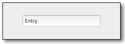
GtkEntry
When using an entry for passwords and other sensitive information, it can be put into "password mode" using the gtk:entry-visibility function. In
this mode, entered text is displayed using a 'invisible' character. By
default, GTK picks the best invisible character that is available in the current font, but it can be changed with the gtk:entry-invisible-char
function. GTK displays a warning when Caps Lock or input methods might
interfere with entering text in a password entry. The warning can be turned off with the caps-lock-warning property. The gtk:entry widget has the ability to display progress or activity
information behind the text. To make an entry display such information, use the gtk:entry-progress-fraction or gtk:entry-progress-pulse-step
functions. Additionally, the gtk:entry widget can show icons at either side of
the entry. These icons can be activatable by clicking, can be set up as drag
source and can have tooltips. To add an icon, use the gtk:entry-set-icon-from-gicon function or one of the various other
functions that set an icon from a stock ID, an icon name or a pixbuf. To
trigger an action when the user clicks an icon, connect to the "icon-press" signal. To allow DND operations from an icon, use the gtk:entry-set-icon-drag-source function. To set a tooltip on an icon, use the gtk:entry-icon-tooltip-text function or the corresponding
function for markup.
Note that functionality or information that is only available by clicking on
an icon in an entry may not be accessible at all to users which are not able
to use a mouse or other pointing device. It is therefore recommended that
any such functionality should also be available by other means, for example
via the context menu of the entry. Style Property Details icon-prelight The icon-prelight style property of type :boolean (Read)
The prelight style property determines whether activatable icons prelight on mouseover.
Warning: The icon-prelight style property has been
deprecated since version 3.20 and should not be used in newly written
code. Use CSS to control the appearance of prelighted icons. The value
of this style property is ignored. inner-border The inner-border style property of type gtk:border (Read) Sets the border of the text area between the text and the frame. Warning: The inner-border style property has been deprecated
since version 3.4 and should not be used in newly written code. Use the
standard border and padding CSS properties through objects like the gtk:style-context and gtk:css-provider objects. The
value of this style property is ignored. invisible-char The invisible-char style property of type :uint (Read)
The invisible character is used when masking entry contents in
"password mode". When it is not explicitly set with the invisible-char property, GTK determines the character
to use from a list of possible candidates, depending on availability in
the current font. This style property allows the theme to prepend a character to the list of candidates.
Default value: 0 progress-border The progress-border style property of type gtk:border (Read) The border around the progress bar in the entry. Warning: The progress-border style property has been
deprecated since version 3.4 and should not be used in newly written
code. Use the standard margin CSS property through objects like the gtk:style-context and gtk:css-provider objects. The
value of this style property is ignored. Signal Details
The "activate" signal
lambda (entry) :action - entry
- The gtk:entry widget on which the signal is emitted.
A keybinding signal which gets emitted when the user activates the entry.
Applications should not connect to it, but may emit it with the g:signal-emit function if they need to control activation
programmatically. The default bindings for this signal are all forms of the Enter key.
The "backspace" signal
lambda (entry) :action - entry
- The gtk:entry widget that received the signal.
A keybinding signal which gets emitted when the user asks for it. The default bindings for this signal are the Backspace and Shift-Backspace keys.
The "copy-clipboard" signal
lambda (entry) :action - entry
- The gtk:entry widget that received the signal.
A keybinding signal which gets emitted to copy the selection to the clipboard. The default bindings for this signal are the Ctrl-c and Ctrl-Insert keys.
The "cut-clipboard" signal
lambda (entry) :action - entry
- The gtk:entry widget that received the signal.
A keybinding signal which gets emitted to cut the selection to the clipboard. The default bindings for this signal are the Ctrl-x and Shift-Delete keys.
The "delete-from-cursor" signal
lambda (entry type count) :action - entry
- The gtk:entry widget that received the signal.
- type
- The granularity of the deletion, as a value of the gtk:delete-type enumeration.
- count
- The integer for the number of type units to delete.
A keybinding signal which gets emitted when the user initiates a text deletion. If the granularity is :chars, GTK deletes
the selection if there is one, otherwise it deletes the requested number of characters. The default bindings for this signal are the Delete key for deleting a character and the Ctrl-Delete key for deleting a
word.
The "icon-press" signal
lambda (entry pos event) :run-last
The signal is emitted when an activatable icon is clicked.
The "icon-release" signal
lambda (entry pos event) :run-last - entry
- The gtk:entry widget on which the signal is emitted.
- pos
- The position of the clicked icon as a value of the gtk:entry-icon-position enumeration.
- event
- The gdk:event instance for the button release event.
The signal is emitted on the button release from a mouse click over an
activatable icon.
The "insert-at-cursor" signal
lambda (entry text) :action - entry
- The gtk:entry widget that received the signal.
- text
- The string for the text to insert.
A keybinding signal which gets emitted when the user initiates the
insertion of a fixed text at the cursor. The signal has no default
bindings.
The "insert-emoji" signal
lambda (entry) :action - entry
- The gtk:entry widget that received the signal.
A keybinding signal which gets emitted to present the Emoji chooser for the entry. The default bindings for this signal are the Ctrl-. and Ctrl-; keys.
The "move-cursor" signal
lambda (entry step count extend) :action - entry
- The gtk:entry widget that received the signal.
- step
- The granularity of the move as a value of the gtk:movement-step enumeration.
- count
- The integer for the number of step units to move.
- extend
- True if the move should extend the selection.
A keybinding signal which gets emitted when the user initiates a cursor
movement. If the cursor is not visible in the entry, this signal causes
the viewport to be moved instead. Applications should not connect to it, but may emit it with the g:signal-emit function if they need to
control the cursor programmatically. The default bindings for this signal come in two variants, the variant with the Shift modifier extends the selection, the variant without the Shift modifier does not.
There are too many key combinations to list them all here. - Arrow keys move by individual characters/lines.
- Ctrl-arrow key combinations move by words/paragraphs.
- Home/End keys move to the ends of the buffer.
The "paste-clipboard" signal
lambda (entry) :action - entry
- The gtk:entry widget that received the signal.
A keybinding signal which gets emitted to paste the contents of the
clipboard into the text view. The default bindings for this signal are the Ctrl-v and Shift-Insert keys.
The "preedit-changed" signal
lambda (entry preedit) :action - entry
- The gtk:entry widget that received the signal.
- preedit
- The current preedit string.
If an input method is used, the typed text will not immediately be
committed to the buffer. So if you are interested in the text, connect to
this signal.
The "toggle-overwrite" signal
lambda (entry) :action - entry
- The gtk:entry widget that received the signal.
A keybinding signal which gets emitted to toggle the overwrite mode of the entry. The default bindings for this signal is the Insert key. |
| Returned bySlot Access FunctionsInherited Slot Access FunctionsSee also |