The
gtk:check-button widget places a discrete
gtk:toggle-button widget next to a widget, usually a
gtk:label widget. See the
gtk:toggle-button documentation for more information about toggle and check buttons. The important
"toggled" signal is also inherited from the
gtk:toggle-button class.
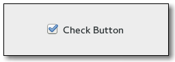
Figure: GtkCheckButton CSS nodes
checkbutton
├── check
╰── <child>
The
gtk:check-button widget with indicator, see the
gtk:toggle-button-mode function, has a main CSS node with name
checkbutton and a subnode with name
check.
button.check
├── check
╰── <child>
A
gtk:check-button widget without indicator changes the name of its main node to
button and adds a
.check style class to it. The
subnode is invisible in this case.
Style Property Details