Package: gtk
Class gtk-radio-button
Superclassesgtk-check-button, gtk-toggle-button, gtk-button, gtk-bin, gtk-container, gtk-widget, gtk-buildable, gtk-actionable, gtk-activatable, g-object, common-lisp:standard-object, common-lisp:t Documented Subclasses
None
Direct SlotsDetails
A single radio button performs the same basic function as a gtk-check-button widget, as its position in the object hierarchy
reflects.
It is only when multiple radio buttons are grouped together that they become
a different user interface component in their own right. 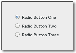 Every radio button is a member of some group of radio buttons. When one is selected, all other radio buttons in the same group are deselected. A gtk-radio-button widget is one way of giving the user a choice from many options. Radio buttons are created with the gtk-radio-button-new function, passing nil as the argument if this is the first radio button in a group. In subsequent calls, the group you wish to add this button to should be passed as an argument. Optionally, the gtk-radio-button-new-with-label function can be used if you want a text label on the radio button. Alternatively, when adding widgets to an existing group of radio buttons, use the gtk-radio-button-new-from-widget function with a gtk-radio-button widget that already has a group assigned to it. The convenience gtk-radio-button-new-with-label-from-widget function is also provided. To retrieve the group a gtk-radio-button widget is assigned to, use the gtk-radio-button-get-group function. To remove a gtk-radio-button widget from one group and make it part of a new one, use the gtk-radio-button-set-group function. CSS nodesradiobutton ├── radio ╰── <child>A gtk-radio-button widget with indicator, see the gtk-toggle-button-mode function, has a main CSS node with name radiobutton and a subnode with name radio. button.radio ├── radio ╰── <child>A gtk-radio-button implementation without indicator changes the name of its main node to button and adds a .radio style class to it. The subnode is invisible in this case. Example
(defun example-radio-button ()
(within-main-loop
(let ((window (make-instance 'gtk-window
:type :toplevel
:title "Example Radio Button"
:border-width 12
:default-width 300
:default-height 120))
(grid (make-instance 'gtk-grid
:orientation :vertical
:halign :center
:valign :center
:row-spacing 18)))
When an unselected radio button in the group is clicked the clicked radio
button receives the "toggled" signal, as does the previously selected
radio button. Inside the "toggled" handler, the gtk-toggle-button-active function can be used to determine if the
button has been selected or deselected. Signal DetailsThe "group-changed" signallambda (button) :run-firstEmitted when the group of radio buttons that a radio button belongs to changes. This is emitted when a radio button switches from being alone to being part of a group of two or more buttons, or vice-versa, and when a button is moved from one group of two or more buttons to a different one, but not when the composition of the group that a button belongs to changes.
| Slot Access FunctionsInherited Slot Access FunctionsSee also |
*2021-12-4