Package: gtk
Class gtk-toggle-button
Superclassesgtk-button, gtk-bin, gtk-container, gtk-widget, gtk-buildable, gtk-actionable, gtk-activatable, g-object, common-lisp:standard-object, common-lisp:t Documented SubclassesDirect SlotsDetails A gtk-toggle-button widget is a gtk-button widget which will
remain "pressed-in" when clicked.
Clicking again will cause the toggle button to return to its normal state. 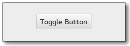 A toggle button is created by calling either the gtk-toggle-button-new or gtk-toggle-button-new-with-label functions. If using the former, it is advisable to pack a widget, such as a gtk-label or a gtk-image widget, into the container of the toggle button. See the gtk-button widget for more information. The state of a gtk-toggle-button widget can be set and retrieved using the gtk-toggle-button-active function. To simply switch the state of a toggle button, use the gtk-toggle-button-toggled function. CSS nodesExample
(defun example-grid-spacing ()
(within-main-loop
(let ((window (make-instance 'gtk-window
:type :toplevel
:title "Example Grid Spacing"
:border-width 12
:default-width 320))
(grid (make-instance 'gtk-grid
:column-homogeneous t
:column-spacing 6
:row-homogeneous t
:row-spacing 6))
(button1 (make-instance 'gtk-toggle-button
:label "More Row Spacing"))
(button2 (make-instance 'gtk-toggle-button
:label "More Col Spacing"))
(button3 (make-instance 'gtk-button
:label "Button 3"))) Signal DetailsThe "toggled" signallambda (togglebutton) :run-firstShould be connected if you wish to perform an action whenever the state of the toggle button is changed.
| Slot Access FunctionsInherited Slot Access FunctionsSee also |
*2021-10-11