Package: gtk

Class gtk-icon-view

Superclasses

gtk-container, gtk-widget, gtk-buildable, gtk-cell-layout, g-object, common-lisp:standard-object, common-lisp:t

Documented Subclasses

None

Direct Slots

activate-on-single-click
The activate-on-single-click property of type :boolean (Read / Write / Construct)
Specifies whether the "item-activated" signal will be emitted after a single click.
Default value: false
cell-area
The cell-area property of type gtk-cell-area (Read / Write / Construct)
The cell area used to layout cell renderers for this view. If no area is specified when creating the icon view a gtk-cell-area-box object will be used.
column-spacing
The column-spacing property of type :int (Read / Write)
Specifies the space which is inserted between the columns of the icon view.
Allowed values: >= 0
Default value: 6
columns
The columns property of type :int (Read / Write)
Contains the number of the columns in which the items should be displayed. If it is -1, the number of columns will be chosen automatically to fill the available area.
Allowed values: >= -1
Default value: -1
item-orientation
The item-orientation property of type gtk-orientation (Read / Write)
Specifies how the cells, i.e. the icon and the text, of the item are positioned relative to each other.
Default value: :vertical
item-padding
The item-padding property of type :int (Read / Write)
Specifies the padding around each of the icon view's item.
Allowed values: >= 0
Default value: 6
item-width
The item-width property of type :int (Read / Write)
Specifies the width to use for each item. If it is set to -1, the icon view will automatically determine a suitable item size.
Allowed values: >= -1
Default value: -1
margin
The margin property of type :int (Read / Write)
Specifies the space which is inserted at the edges of the icon view.
Allowed values: >= 0
Default value: 6
markup-column
The markup-column property of type :int (Read / Write)
Contains the number of the model column containing markup information to be displayed. The markup column must be of type "gchararray". If this property and the text-column property are both set to column numbers, it overrides the text column. If both are set to -1, no texts are displayed.
Allowed values: >= -1
Default value: -1
model
The model property of type gtk-tree-model (Read / Write)
The model for the icon view.
pixbuf-column
The pixbuf-column property of type :int (Read / Write)
Contains the number of the model column containing the pixbufs which are displayed. The pixbuf column must be of type "GdkPixbuf". Setting this property to -1 turns off the display of pixbufs.
Allowed values: >= -1
Default value: -1
reorderable
The reorderable property of type :boolean (Read / Write)
The reorderable property specifies if the items can be reordered by DND.
Default value: false
row-spacing
The row-spacing property of type :int (Read / Write)
Specifies the space which is inserted between the rows of the icon view.
Allowed values: >= 0
Default value: 6
selection-mode
The selection-mode property of type gtk-selection-mode (Read / Write)
Specifies the selection mode of an icon view. If the mode is :multiple, rubberband selection is enabled, for the other modes, only keyboard selection is possible.
Default value: :single
spacing
The spacing property of type :int (Read / Write)
Specifies the space which is inserted between the cells, i.e. the icon and the text, of an item.
Allowed values: >= 0
Default value: 0
text-column
The text-column property of type :int (Read / Write)
Contains the number of the model column containing the texts which are displayed. The text column must be of type "gchararray". If this property and the markup-column property are both set to -1, no texts are displayed.
Allowed values: >= -1
Default value: -1
tooltip-column
The tooltip-column property of type :int (Read / Write)
The column in the model containing the tooltip texts for the items.
Allowed values: >= -1
Default value: -1

Details

The gtk-icon-view class provides an alternative view on a gtk-tree-model object. It displays the model as a grid of icons with labels. Like the gtk-tree-view widget, it allows to select one or multiple items, depending on the selection mode, see the function gtk-icon-view-selection-mode. In addition to selection with the arrow keys, the gtk-icon-view class supports rubberband selection, which is controlled by dragging the pointer.


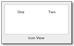
Note that if the tree model is backed by an actual tree store, as opposed to a flat list where the mapping to icons is obvious, the gtk-icon-view widget will only display the first level of the tree and ignore the tree's branches.

Style Property Details

selection-box-alpha
The selection-box-alpha style property of type :uchar (Read)
Opacity of the selection box.
Warning: The selection-box-alpha style property has been deprecated since version 3.20 and should not be used in newly written code. The opacity of the selection box is determined by CSS. The value of this style property is ignored.
Default value: 64
selection-box-color
The selection-box-color style property of type gdk-color (Read)
Color of the selection box.
Warning: The selection-box-color style property has been deprecated since version 3.20 and should not be used in newly written code. The color of the selection box is determined by CSS. The value of this style property is ignored.

Signal Details

The "activate-cursor-item" signal
 lambda (view)    :action      
A keybinding signal which gets emitted when the user activates the currently focused item. Applications should not connect to it, but may emit it with the g-signal-emit function if they need to control activation programmatically. The default bindings for this signal are the Space, Return and Enter keys.
view
The gtk-icon-view widget on which the signal is emitted.
The "item-activated" signal
 lambda (view path)    :run-last      
The signal is emitted when the gtk-icon-view-item-activated function is called or the user double clicks an item. It is also emitted when a non-editable item is selected and one of the Space, Return or Enter keys is pressed.
view
The gtk-icon-view widget on which the signal is emitted.
path
The gtk-tree-path instance for the activated item.
The "move-cursor" signal
 lambda (view step count)    :action      
The signal is a keybinding signal which gets emitted when the user initiates a cursor movement. Applications should not connect to it, but may emit it with the g-signal-emit function if they need to control the cursor programmatically. The default bindings for this signal include
  • Arrow keys which move by individual steps.
  • Home/End keys which move to the first/last item.
  • PageUp/PageDown which move by "pages".
All of these will extend the selection when combined with the Shift modifier.
view
The gtk-icon-view widget which received the signal.
step
The granularity of the move, as a value of the gtk-movement-step enumeration.
count
An integer with the number of step units to move.
The "select-all" signal
 lambda (view)    :action      
A keybinding signal which gets emitted when the user selects all items. Applications should not connect to it, but may emit it with the g-signal-emit function if they need to control selection programmatically. The default binding for this signal is the Ctrl-a key.
view
The gtk-icon-view widget on which the signal is emitted.
The "select-cursor-item" signal
 lambda (view)    : Action      
A keybinding signal which gets emitted when the user selects the item that is currently focused. Applications should not connect to it, but may emit it with the function g-signal-emit if they need to control selection programmatically. There is no default binding for this signal.
view
The gtk-icon-view widget on which the signal is emitted.
The "selection-changed" signal
 lambda (view)    : Run First      
The signal is emitted when the selection changes, i.e. the set of selected items.
view
The gtk-icon-view widget on which the signal is emitted.
The "toggle-cursor-item" signal
 lambda (view)    :action      
A keybinding signal which gets emitted when the user toggles whether the currently focused item is selected or not. The exact effect of this depend on the selection mode. Applications should not connect to it, but may emit it with the g-signal-emit function if they need to control selection programmatically. The default binding for this signal is the Ctrl-Space key.
view
The gtk-icon-view widget on which the signal is emitted.
The "unselect-all" signal
 lambda (view)    :action      
A keybinding signal which gets emitted when the user unselects all items. Applications should not connect to it, but may emit it with the g-signal-emit function if they need to control selection programmatically. The default binding for this signal is the Ctrl-Shift-a key.
view
The gtk-icon-view widget on which the signal is emitted.
 

Slot Access Functions

Inherited Slot Access Functions

See also

2021-3-9