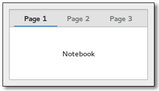
The
gtk-notebook widget is a
gtk-container widget whose
children are pages that can be switched between using tab labels along one
edge.
There are many configuration options for
gtk-notebook widgets. Among
other things, you can choose on which edge the tabs appear, see the
gtk-notebook-tab-pos function, whether, if there are too many tabs to
fit the notebook should be made bigger or scrolling arrows added, see the
gtk-notebook-scrollable function, and whether there will be a popup menu allowing the users to switch pages, see the
gtk-notebook-popup-enable and
gtk-notebook-popup-disable functions.
GtkNotebook as GtkBuildable
The
gtk-notebook implementation of the
gtk-buildable interface supports placing children into tabs by specifying
"tab" as the
"type" attribute of a
<child> element. Note that the
content of the tab must be created before the tab can be filled. A tab child can be specified without specifying a
<child> type attribute. To add a child widget in the notebooks action area, specify
"action-start" or
"action-end" as the
"type" attribute of the
<child> element.
Example: A UI definition fragment with the
gtk-notebook widget
<object class="GtkNotebook">
  <child>
    <object class="GtkLabel" id="notebook-content">
      <property name="label">Content</property>
    </object>
  </child>
  <child type="tab">
    <object class="GtkLabel" id="notebook-tab">
      <property name="label">Tab</property>
    </object>
  </child>
</object>
CSS nodes
  notebook
  ├── header.top
  │   ├── [<action widget>]
  │   ├── tabs
  │   │   ├── [arrow]
  │   │   ├── tab
  │   │   │   ╰── <tab label>
  ┊   ┊   ┊
  │   │   ├── tab[.reorderable-page]
  │   │   │   ╰── <tab label>
  │   │   ╰── [arrow]
  │   ╰── [<action widget>]
  │
  ╰── stack
      ├── <child>
      ┊
      ╰── <child>
The
gtk-notebook implementation has a main CSS node with name
notebook, a subnode with name
header and below that a subnode with name
tabs which contains one subnode per tab with name
tab.
If action widgets are present, their CSS nodes are placed next to the tabs node. If the notebook is scrollable, CSS nodes with name
arrow are
placed as first and last child of the tabs node.
The main node gets the
.frame style class when the notebook has a border, see the
gtk-notebook-show-border function.
The header node gets one of the
.top,
.bottom,
.left or
.right style classes, depending on where the tabs are placed. For reorderable pages, the tab node gets the
.reorderable-page style
class.
A tab node gets the
.dnd style class while it is moved with
drag and drop.
The nodes are always arranged from left-to-right, regardless of text
direction.
Child Property Details
- detachable
- The detachable child property of type :boolean (Read / Write)
Whether the tab is detachable.
Default value: false - menu-label
- The menu-label child property of type :string (Read / Write)
The string displayed in the menu entry of the child page.
Default value: nil - position
- The position child property of type :int (Read / Write)
The index of the child page in the parent.
Allowed values: >= 0
Default value: 0 - reorderable
- The reorderable child property of type :boolean (Read / Write)
Whether the tab is reorderable by user action.
Default value: false - tab-expand
- The tab-expand child property of type :boolean (Read / Write)
Whether to expand the tab of the child page.
Default value: false - tab-fill
- The tab-fill child property of type :boolean (Read / Write)
Whether the tab of the child page should fill the allocated area.
Default value: true - tab-label
- The tab-label child property of type :string (Read / Write)
The string displayed on the tab label of the child page.
Default value: nil
Style Property Details
- arrow-spacing
- The arrow-spacing style property of type :int (Read)
Defines the spacing between the scroll arrows and the tabs.
Warning: The arrow-spacing style property has been
deprecated since version 3.20 and should not be used in newly written code. This property is ignored. Use margins on arrows or the tabs node to achieve the same effect.
Allowed values: >= 0
Default value: 0 - has-backward-stepper
- The has-backward-stepper style property of type :boolean (Read)
Determines whether the standard backward arrow button is displayed.
Default value: true - has-forward-stepper
- The has-forward-stepper style property of type :boolean (Read)
Determines whether the standard forward arrow button is displayed.
Default value: true - has-secondary-backward-stepper
- The has-secondary-backward-stepper style property of type :boolean (Read)
Determines whether a second backward arrow button is displayed on the opposite end of the tab area.
Default value: false - has-secondary-forward-stepper
- The has-secondary-forward-stepper style property of type :boolean (Read)
Determines whether a second forward arrow button is displayed on the opposite end of the tab area.
Default value: false - has-tab-gap
- The has-tab-gap style property of type :boolean (Read)
Defines whether the active tab is draw with a gap at the bottom.
Warning: The has-tab-gap style property has been deprecated
since version 3.20 and should not be used in newly written code. This function always behaves as if it was set to false.
Default value: true - initial-gap
- The initial-gap style property of type :int (Read)
Defines the minimum size for the initial gap between the first tab.
Warning: The initial-gap style property has been deprecated
since version 3.20 and should not be used in newly written code. The
intial gap is ignored. Use margins on the header node to achieve the same effect.
Allowed values: >= 0
Default value: 0 - tab-curvature
- The tab-curvature style property of type :int (Read)
Defines size of tab curvature.
Warning: The tab-curvature style property has been
deprecated since version 3.20 and should not be used in newly written
code. This property is ignored. Use margins on tab nodes to achieve the same effect.
Allowed values: >= 0
Default value: 1 - tab-overlap
- The tab-overlap style property of type :int (Read)
Defines size of tab overlap area.
Warning; The tab-overlap style property has been deprecated
since version 3.20 and should not be used in newly written code. This
property is ignored. Use margins on tab nodes to achieve the same effect.
Default value: 2
Signal Details
The "change-current-page" signal
lambda (notebook offset) :action
- notebook
- The gtk-notebook widget emitting the signal.
- offset
- An integer with the offset to step forward or backward for a negative integer.
The "create-window" signal
lambda (notebook page x y) :run-last
The signal is emitted when a detachable tab is dropped on the root window.
A handler for this signal can create a window containing a notebook where
the tab will be attached. It is also responsible for moving/resizing the
window and adding the necessary properties to the notebook, e.g. the
group-name property.
- notebook
- The gtk-notebook widget emitting the signal.
- page
- The gtk-widget tab of notebook that is being detached.
- x
- An integer with the x coordinate where the drop happens.
- y
- An integer with the y coordinate where the drop happens.
- Returns
- A gtk-notebook widget that page should be added to, or nil.
The "focus-tab" signal
lambda (notebook tab) :action
- notebook
- The gtk-notebook widget emitting the signal.
- tab
- A value of the gtk-notebook-tab enumeration.
The "move-focus-out" signal
lambda (notebook direction) :action
- notebook
- The gtk-notebook widget emitting the signal.
- direction
- A value of the gtk-direction-type enumeration.
The "page-added" signal
lambda (notebook child num) :run-last
The signal is emitted in the notebook right after a page is added to the
notebook.
- notebook
- The gtk-notebook widget emitting the signal.
- child
- The gtk-widget child page affected.
- num
- An unsigned integer with the child page number.
The "page-removed" signal
lambda (notebook child num) :run-last
The signal is emitted in the notebook right after a page is removed from
the notebook.
- notebook
- The gtk-notebook widget emitting the signal.
- child
- The gtk-widget child page affected.
- num
- An unsigned integer with the child page number.
The "page-reordered" signal
lambda (notebook child num) :run-last
The signal is emitted in the notebook right after a page has been
reordered.
- notebook
- The gtk-notebook widget emitting the signal.
- child
- The gtk-widget child page affected.
- num
- An unsigned integer with the child page number.
The "reorder-tab" signal
lambda (notebook direction move-to-last) :action
- notebook
- The gtk-notebook widget emitting the signal.
- direction
- A value of the gtk-direction-type enumeration.
- move-to-last
- A boolean.
The "select-page" signal
lambda (notebook move-focus) :action
- notebook
- The gtk-notebook widget emitting the signal.
- move-focus
- A boolean.
The "switch-page" signal
lambda (notebook page num) :run-last
Emitted when the user or a function changes the current page.
- notebook
- The gtk-notebook widget emitting the signal.
- page
- The gtk-widget current page.
- num
- An unsigned integer with the index of the page.